· By Trudy Sheild
The SHEiLD Label - A True Story
The Company “Drinks Cabinet” was formed in Spring 2021, and consists of Blair Gibbs who attends to sales, marketing, and all things big or small between, and myself Trudy Sheild -Winemaker or the cook as I often think of my role. Before this we were both employed in similar roles for Middle Earth and Brightwater Gravels wines. When owner Rob decided to retire from the industry, he bequeathed us these wine brands. We quickly took the decision to rebrand Middle Earth and Blair (after one too many wines) mooted SHEiLD….
Being a wee bit cautious, I cannot say I jumped at the idea! But came around to the idea when I twigged that with this very personal branding I only ever need to show up and be myself! The trick now was to produce imagery and a font that felt authentic and would portray our dedication and persistence.
It was only a few weeks before my 50th birthday that I phoned Blair’s friend and designer Steve of Sprout Design to discuss possibilities. Likely the proximity to such a milestone had me feeling reflective and I discussed with Steve that it takes the collaboration of many more people, not just a winemaker to get a great wine all the way from the vineyard and into a beautifully labelled bottle! I also reflected on the opportunities I had been afforded by family and the exhilarating opportunities I have experienced in the industry. We chuckled gratefully how Blair had featured on both of our journeys to date, several times! Steve commented to me that I was giving him the feeling ‘it’s about all the people” and I and could not agree more.
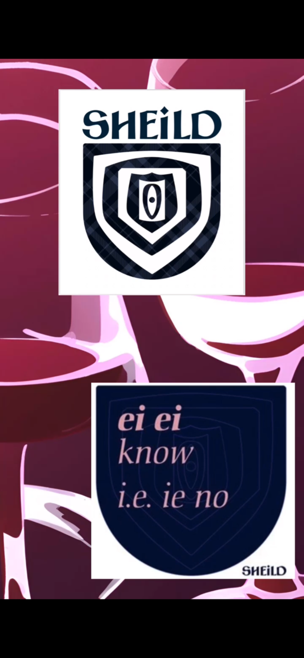
Next port of call was my dad and I encouraged him to write down our surname for me. He wondered why!? Steve worked up his handwriting and his quirky habit of writing in capitals with the odd under case letter into our own unique font we use for SHEiLD. The Celtic feel and tartan background are a nod to both our Celtic heritages, it’s look is warmly familiar to me. As for the logo it was just too irresistible not to use a shield image and onto this, we have layered shields of different origins one upon the other to acknowledge “all the people,” the dwindling or increasing size hence tunnel effect marking the passage of time.
I endeavour therefore year upon year to make beautiful wines that I’m proud to share with ‘my people’ and that you can share with confidence with your people. May it be so good we make new friends with it too! I hope the packaged product brings a sense of pride to the many people involved, that we shared the laughs the challenges and precious time with – you know who you are.